Native app UX/UI Design for Avid Recovery, improving the physical and mental well-being of patients
UX Design • UX Research • Prototyping • Figma


What is Avid Sports Medicine?
Avid Sports Medicine offers the latest in medical care to prevent, evaluate, treat, and rehabilitate injuries for both recreational and competitive athletes of all ages. They also help people with active jobs who sometimes suffer the same care.
They wanted to expand their services in a way that makes their holistic approach to sports medicine and pain management accessible to the masses.


Research and Ideation
In order to understand the challenges and constraints experienced by the sports medicine industry and video platforms, my first step was to conduct research on several platforms such as YouTube, Strava, Headspace, and Nike Traning Club to explore the features that they offer.
Instant access to information about health concerns
Possibility of inaccurate self-diagnosis


Strava is an app that is great for community engagement and progress tracking which are features that Avid aspires to emulate
In order to deepen our understanding of mental health, we looked into headspace’s design and features


The Nike Training club offers easy-to-follow videos with instructions
Afterwards, I sent out screener surveys to identify those who were qualified to participate in our research.
60%
of participants qualified after 50 surveys were sent out
32
users had experience dealing with injuries
12
users were retained from our personal network and Avid’s clients
After conducting interviews, I found out that the main themes were injury knowledge, healthcare, motivation, and frustrations. To my surprise, mental health was a really big setback for many of our participants. It wasn't merely a matter of addressing their injuries; it was also about helping them navigate the challenge of not being able to engage in physical activity, which, for many, served as a form of personal therapy.
Understanding the research

“My mental health suffers when I am in recovery because I rely on my active lifestyle to make me feel good”

“I want to know exactly what my recovery process looks like so I can go back to doing what I love most ASAP”

“Being active for me is more than being fit. It’s like drinking water or eating food. When I can’t do the things I love, I don’t feel like myself. I feel lonely.”
The Problem
Our objective became clearer; we needed to educate our clients about their injuries, prevent future ones, facilitate a speedy recovery, and address their mental well-being.
To address these issues, we came up with 3 essential “How Might We” questions:
How might we educate and guide users through exercises
How might we help users be more involved in their recovery process
How might we alleviate anxiety and uncertainty among users
The Solution
Avid Recovery will offer personalized education, guidance, and support during the recovery period. It provides customized information on recovery, injury prevention, alongside interactive features for tracking progress and assistance with mental health.
Visual Design
The userflow focuses on guiding the user through their recovery process while informing them about their injury.
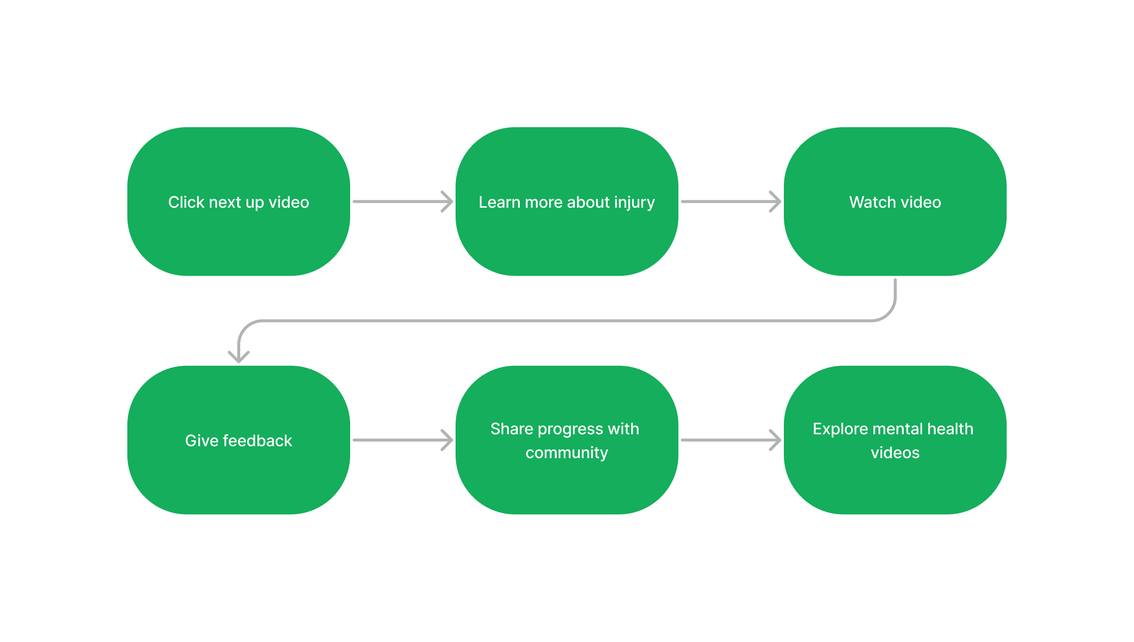
To provide a visual representation of the user interface for Avid, I create a series of sketched frames. These initial rough sketches offer a glimpse into the early stages of our design journey, providing valuable insights into the features we aspired to implement


As we transitioned from sketches to low-fidelity wireframes, we began to refine our initial ideas into more structured and tangible representations of the user interface

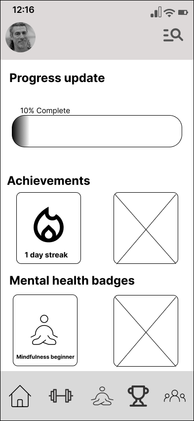
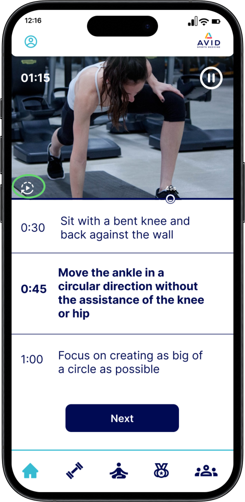
Time stamps with text explaining the workout throughout the video
Progress bar designed to give users more transparency in their path to recovery
Also serves as a motivational tool
Usability Testing
I had the chance to test the prototype with numerous classmates and Avid clients. The task was simple: Log in to their Avid account and begin the assigned exercise. Then, watch a meditation video and view their achievements. I found 3 common complications with the prototype and later implemented the feedback

The progress bar was slightly confusing. 10% of what?

Users wanted a way to rewatch the video


Users were confused about what to do after watching the video. Missing an indication that the video is completed
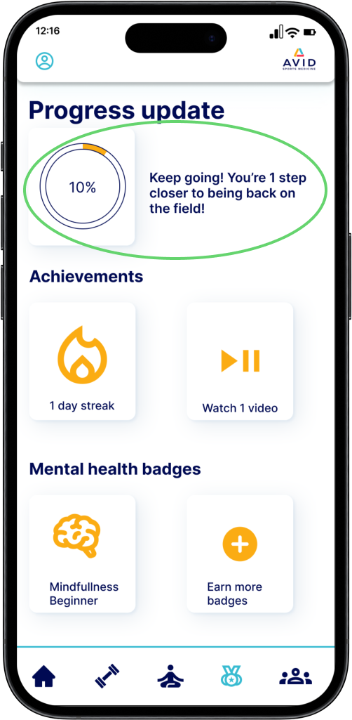
Added a short description of what their progress means

Created a new screen indicating video is completed
New loop button at the bottom left of the video so users can easily repeat the video
Clickable Prototpye
Next Steps/Key Takeaways
Design for people who complete their recovery
Add live videos
Create a lengthy onboarding process to understand behavioral patterns & preferences to predict outcomes & further personalize the user experience
Collaborating within a gorup can present its share of challenges, and effective communication plays a pivotal role in ensuring productivity. I learned that establishing clear deadlines from the beginning is crucial to maintaining focus and progress. It’s also important to attend group/client meetings with an open mindset to foster a collaborative and productive atmosphere